Auri

Platform
Mobile App
Timeline
Dec 2025
Role
UX/UI Designer
Auri is a concept mental health check-in app designed to support gentle reflection and emotional awareness through a short, low-effort daily flow.
© Auri

Design Goals
Create a calm check-in flow that can be completed in under two minutes
Reduce cognitive load by asking one simple question per screen
Use clear, non-judgmental language to support emotional safety
Design a visually soothing interface that encourages trust and repeat use
Audience & Insight
Auri is designed for adults who value emotional wellbeing but may feel overwhelmed, busy, or mentally fatigued. They want tools that feel supportive and private, rather than clinical or productivity-driven.
When users are emotionally low, even small points of friction can feel overwhelming. Simplicity, clarity, and optionality matter more than feature depth.
Experience Overview
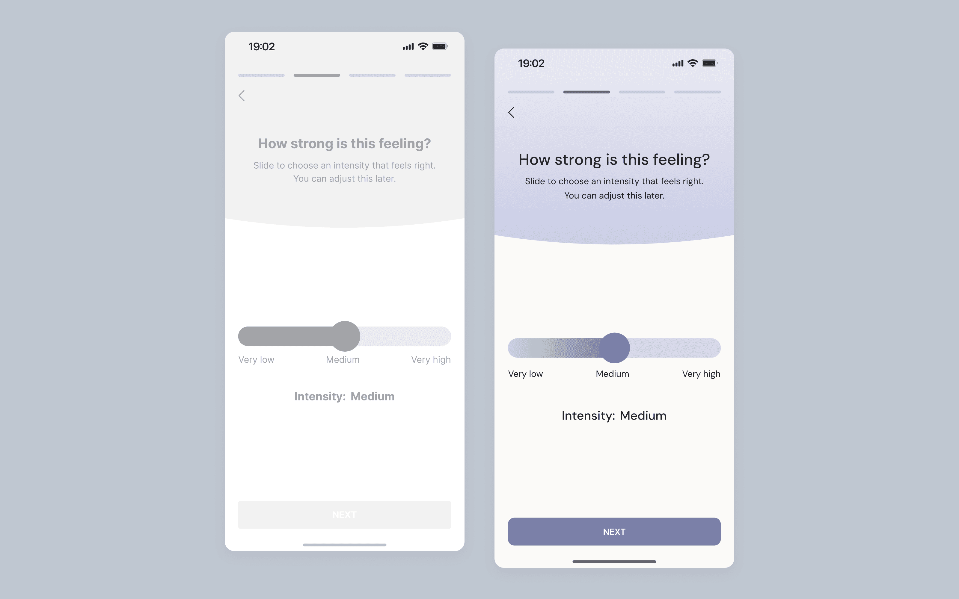
The experience centres around a short, guided check-in that encourages users to pause and reflect without pressure. Users are led through mood selection, intensity, and optional context and micro-reflections in a linear, predictable flow.
The flow is designed to feel supportive rather than analytical, helping users build awareness gradually without demanding consistency or depth.

Key Design Decisions
Structured the flow as a series of single-question screens to reduce cognitive load
Used descriptive language instead of numbers or metrics to avoid judgment
Included optional steps and visible "skip" actions to support autonomy
Prioritised gentle pacing, soft contrast, and clear hierarchy to reinforce emotional safety
Outcome & Testing
Usability testing showed that the check-in flow was clear, calm, and easy to complete. Some users would benefit from clearer signals around optional steps and emotional closure, highlighting opportunities to further reduce perceived effort during low-energy moments.
Key outcomes:
89% of participants rated the flow 4–5 / 5 for ease of use
100% reported that it was clear what to do next throughout the flow
The overall tone was consistently described as calm and supportive
The end-of-flow insight was highlighted as the most valuable and reassuring moment

Next Steps
Refine the mood intensity step by anchoring the scale with more descriptive language
Reduce pressure in the context selection step by introducing an explicit "Not sure" option
Strengthen the sense of closure on the final screen by clearly positioning any follow-up actions as optional
Problem
Many mood-tracking and mental health apps feel overwhelming, data-heavy, or emotionally cold, making it difficult for users to check in during periods of low energy or stress.
Solution
Auri offers a calm, guided check-in experience that breaks reflection into small, optional steps, supporting emotional awareness without pressure or judgment.
KITRI
Wair